By Mike Loughrin, CEO for Transformance Advisors
Staying In Control
What if you get to the end of an expensive improvement project and you discover the changes have not completely eliminated all problems?
Believe it, or not, this does happen! In many cases, a root cause, impacting the process was not detected during the project. You need to monitor a process, after any improvement project, to watch for signs of an “out of control” situation.
The tool to leverage is control charts, which employ a combination of statistical and graphical methods to give you a look at what’s happening inside any process. These charts can help you identify any remaining, or brand new, process performance issues.
Control charts are a key tool from a best practice called Statistical Process Control and also an important tool used in the control step from Six Sigma. But, the really great news, is how you can use control charts without any need to have official Statistical Process Control or Six Sigma programs at your organization.

“All improvement happens project by project and in no other way.”
– Joseph M. Juran
Control Charts Basics
Control charts have a few standard features:
- Process performance on the vertical axis – labeled on the left-hand side
- Time or occurrences on the horizontal axis – labeled on the bottom
- Upper and lower control limits – when is the process out of control
- Performance measurements over time or occurrence
- Common sense chart title and any required definitions
There are four characteristics of a process which is in control:
- Most points are near the middle – the mean
- About an equal number of points are over and under the mean
- Just a few points are near the control limits
- No points are outside of the control limits
All Types of Processes
You can create a control chart for almost any process.
A few examples:
- Daily or monthly sales
- Hotel room cleaning
- Emergency room wait time
- Customer order cycle time
- Quality measurements
- Supplier deliveries
- Customer complaints
Think of a control chart as a picture of a process over time.

“Uncontrolled variation is the enemy of quality.”
– W. Edwards Deming
Setting Control Limits
In the traditional approach, upper and lower control limits are established using the standard deviation calculation. The upper limit is set at +3 standard deviations from the mean. The lower limit is set at -3 standard deviations from the mean.
The idea is how +/- 3 standard deviations will capture 99.7% of occurrences. You will be out of control 0.3% of the time.
In reality, you can be much more creative in setting the control limits. Go with limits which signal you to take action. The key word is action – do not set control limits which just cause someone to shrug and move on to something more interesting.
Examples of creative control limits:
- Daily sales are too low – a meeting with marketing and sales is needed right now
- Daily sales are way above average – it’s time to celebrate
- Hotel room cleaning is finishing up too late or too early – let’s audit the process to see what’s happening
- Emergency room wait times are too long or too short – it’s time to adjust staffing or equipment
- Customer order cycle time is too long or too short – another signal to audit the process
Only your imagination can set boundaries to what is possible for tracking on a control chart.
No Need To Wait
An advanced concept, when using control charts, comes from the world of statistical process control. This concept proclaims you can monitor a process and identify situations where you should intervene before one of the control limits is breached.
Think of predicting the need to act, before it is obvious you need to do so.
There are 7 scenarios which provide advanced insight:
- 7 points on the same side of the center line
- 7 points moving in the same direction – up or down
- 14 consecutive points are alternating up and down – 7 ups and downs
- 2 out of 3 consecutive points are more than 2 sigmas from the center line – in the same direction
- 4 out of 5 consecutive points are more than 1 sigma from the center line – in the same direction
- 15 consecutive points are within 1 sigma of the center line
- 8 consecutive points on either side of the center line – not within 1 sigma
Let’s look closer at the first 3 scenarios, known as the “rule of 7” tests. The last 4 are getting too far into the weeds of statistics for this article.

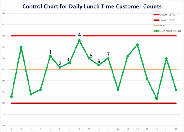
7 points on the same side of the center line
This scenario implies there has been a shift in the process.
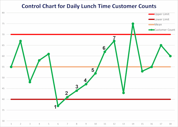
7 points moving in the same direction – up or down
This scenario implies there is a trend taking place.
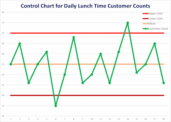
7 ups and downs
This scenario implies there is some sort of variation which is not the normal randomness you would expect.
Rules Vary
There are different versions of these rules or scenarios.
The original “Shewhart Control Chart Rules” have scenario 1 as 9 points and scenario 2 as 6 points.
Nothing is stopping you from crafting your set of rules! You know what drives your process variation. What signal can become your call to action?

Summary
Implementation of an improved process is not the end of any improvement project.
Three common challenges, after implementation, need to be monitored:
- You did not eliminate all the root causes which impact process performance
- Changes are not ingrained and things slip back to the old practices
- Something in the world changes and the improved process is under attack from a new challenge
One of the very best tools, for monitoring a process improvement, is the control chart.
“I took the one less traveled and that has made all the difference.”
– Robert Frost
Mike Loughrin is the CEO and Founder of Transformance Advisors. He also teaches for Louisiana State University Shreveport and is on the board of directors for the Association for Supply Chain Management Northern Colorado.
Mike brings exceptional experience in industry, consulting services, and education. He has directed several Lean Transformation programs and has helped organizations such as Levi Strauss, Warner Bros., Cabela’s, Constellation Brands, Lexmark, CoorsTek, and Sweetheart Cup.
Keeping a commitment to a balanced life, Mike loves downhill skiing, bicycle rides, and hiking in the mountains. See one of his trails of the month at: Little Switzerland.
Subscribe to our newsletter
References
Shewhart Control Chart Rules from Analyze It
